

Since 2005, Oogachaga has adopted various logos to visually represent the organisation in printed and digital collaterals and other publicity materials.
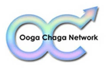
In 2005, as the ‘Ooga Chaga Network’ of support groups were becoming more established, a logo was adopted for the Yahoo Group mailing list, where all support group participants who completed the programme were invited to join. This was used in a limited way, before the need for a visible organisational identity.

Subsequently, an official logo was designed, formalising ‘Oogachaga’ as a single word, and incorporating pink and brown as the organisation’s official colours.
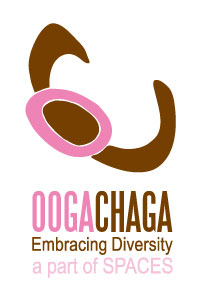
This version of the logo was designed by Kyn Chan in 2008, who explained it as follows: “The letters ‘O’ and ‘C’ have been arranged in freehand lines in the form of a person giving a hug - directly relating to the idea of ‘embracing diversity’. The variations are of a person in side or top view.”

In 2013, with the help of Bounce Agency Pte Ltd, the logo was updated to give it a more contemporary look and cleaner finish. In 2015, the name ‘Oogachaga’ and logo were successfully trademarked.

In 2019, to mark our 20th anniversary, we incorporated a rainbow kaleidoscope motif to represent the diversity of individuals and communities that Oogachaga has been supporting continuously for the past 20 years. This is the winning design out of 4, and was selected by volunteers at the Thank You Dinner on 3 Jan 2019. Design is by Bryan Choong, former executive director of Oogachaga.

In 2024, to mark 25 years since the first “Ooga Chaga” men’s support group met in 1999, an anniversary logo incorporating a rainbow mosaic was designed and launched at the anniversary fund-raising event on 6th June at the P.S. Cafe at Ann Siang Hill.
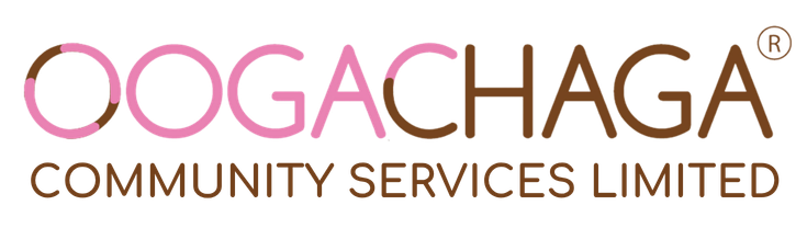
On 1 July 2026, it was announced that Oogachaga would officially be known as Oogachaga Community Services Limited, with all services and programmes to be formally transferred from the former to the latter. A new logo was adopted to reflect this change.